

STYLE GUIDE
Logo

App Icon

Colors

Typography

Iconography

Imagery


UI Elements

RESPONSIVE DESIGN
Since Zestly is a responsive web app, after designing for a small breakpoint (mobile devices), I then designed for medium and large breakpoints (tablet and laptop devices).
PROTOTYPE
Check out the prototype here.
TAKEAWAYS
-
Choose colors that are usable in a digital environment.
-
Having a variety of tints and shades of selected colors provides flexibility later on.
-
Black text on a white background has higher visibility than white text on a dark background.
-
Color, typography, and spacing guides can be used to create visual hierarchy.
-
Use a mood board to communicate the visual direction to teams, clients, employers, and other stakeholders.
-
Differentiate primary/secondary buttons from selected/unselected; don't change color between selected and unselected states.
-
Use password strength appropriate to the application; strict password validation is only necessary for financial, legal, or health platforms.
NEXT STEPS
-
Add features
-
Monthly payments calculator
-
Risk assessment, eg fire, drought
-
Insurance estimator
-
Mortgage financing
-
-
Improve accessibility
-
Conduct additional rounds of usability testing and iteration
Real Estate Made Easy

AN ALL-IN-ONE PROPERTY PLATFORM
Zestly is a responsive web app that provides both buyers and sellers a platform to list and view properties, work with an agent, and sell and invest in property.
Role
UI Designer
Skills
Visual Design/UI, Prototyping, Design System
UX BRIEF
Objective
Zestly is a user-friendly, responsive web app that buyers use to search for properties and decide on where to invest. It is a platform of properties that are on the market and contains comprehensive information for each listing. Zestly provides both experienced and first-time buyers with reliable, straightforward information on their potential property investments.
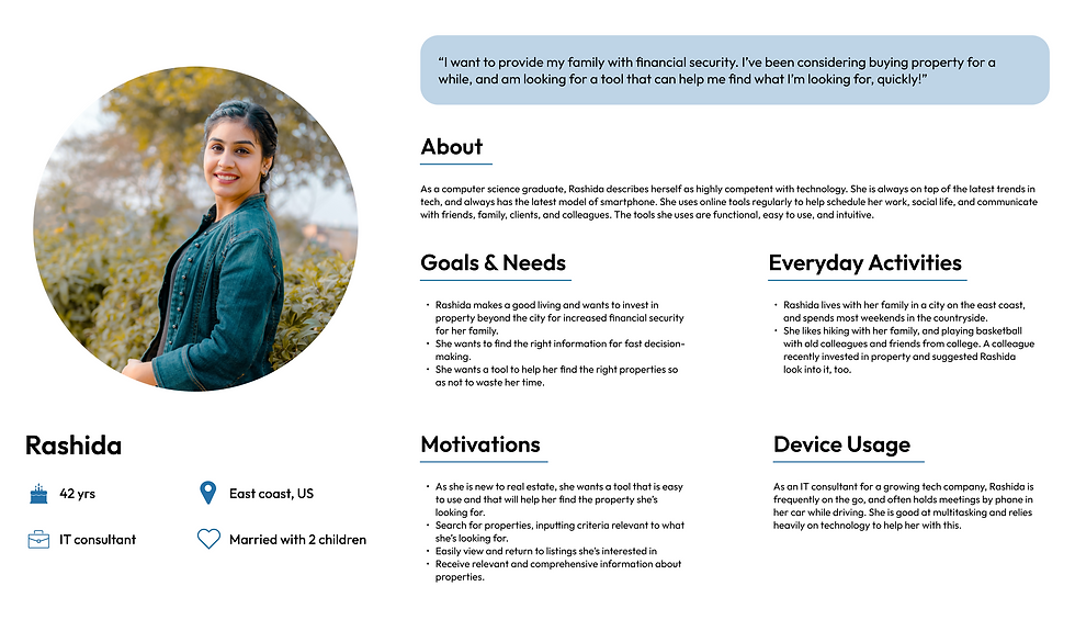
User Persona

FOCUSING ON USER GOALS
I started by creating a user flow to show how Rashida would get from creating an account on Zestly to contacting an agent.

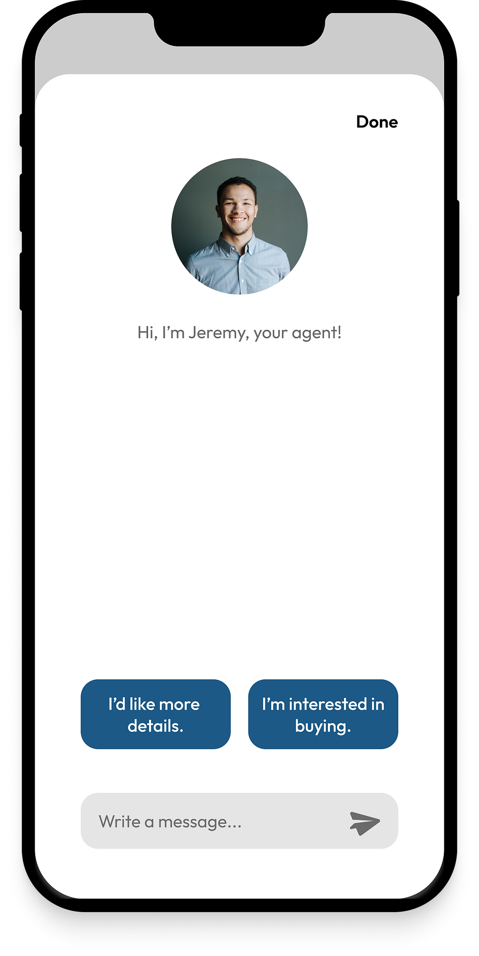
I then used the user flow to determine what screens Rashida would need to accomplish her goal of contacting an agent for more information on a property and designed low fidelity wireframes. By applying principles of visual hierarchy and spacing, a responsive grid, and UI design patterns, I designed mid fidelity wireframes.
SETTING THE VISUAL DIRECTION
Next, I created two mood boards to decide on a distinct style and visual direction before establishing a design system.

Keywords: clean, modern, innovative

Keywords: bright, natural, airy
I chose to move forward with the bright, natural, and airy mood board. Because Rashida needs to be able to absorb new information quickly and easily, a light design will be more legible and keep her from being overwhelmed by dark, overbearing themes. Rashida does not want to waste time and is used to apps that are functional, easy to use, and intuitive. A clean, uncomplicated UI will allow her to absorb property details efficiently and to quickly make decisions on which properties she’s interested in and wants to move forward with.
Using the mood board, I took the wireframes to high fidelity and documented a style guide.
HIGH FIDELITY UI


